Unlocking Typography's Power: Elevate Design with Thoughtful Letters
Jul 13, 2024
Branding

Typography is often underestimated, seen by some as merely the choice of pretty letters to fill space. But in truth, it’s much more than that—it's a sophisticated craft that weaves design and communication together. At its core, typography is about using letters, fonts, and text strategically to enhance both the visual appeal and effectiveness of your message. A well-executed typographic design can boost readability, establish hierarchy, evoke emotions, and even reinforce brand identity.
In this blog, we’ll explore how you can leverage the art of typography to elevate your designs, create engaging user experiences, and communicate your message with clarity and impact.
Understanding the Basics: The Elements of Typography
Before diving into the more advanced techniques, it’s important to understand the key elements that make up typography. By mastering these foundational concepts, you’ll gain the tools needed to approach any project with confidence.
1. Font Family
A font family is a group of related typefaces that share common design traits. For example, the Arial family includes different styles like regular, italic, bold, and black. Think of it as a family tree where each font is a sibling with its own distinct characteristics, yet all are united by a similar appearance.
2. Style
Font styles are variations within a family that allow for creative expression. For example, a bold style may give a design more impact, while an italic style can add sophistication or emphasis to a specific word or phrase.
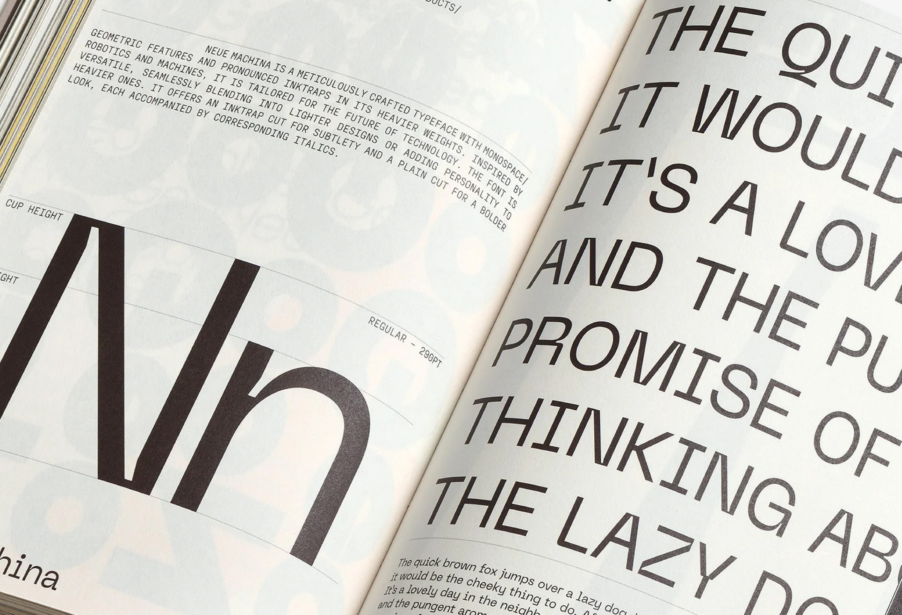
3. Weight
Weight refers to the thickness of the characters in a typeface. Ranging from thin and light to thick and bold, weight plays a crucial role in creating visual contrast and guiding the reader’s eye.
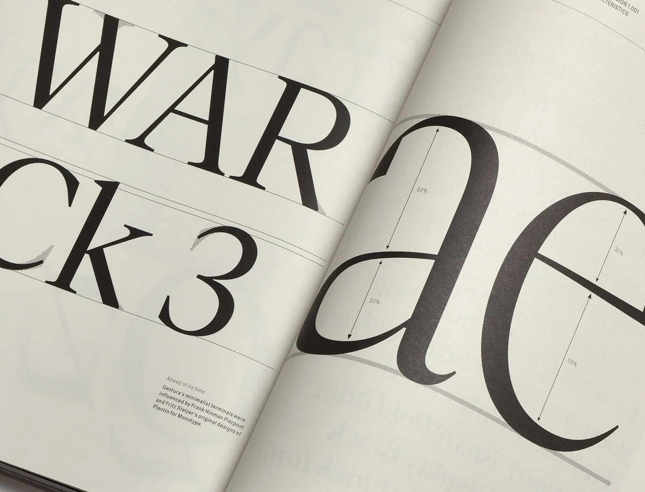
4. Features
Some fonts come with special design elements that add character and distinction. Serifs, which are the small lines or strokes at the ends of letters, give traditional fonts a formal or elegant feel. On the other hand, sans-serif fonts—those without serifs—provide a clean, modern, and approachable look.
5. Spacing
Kerning, tracking, and leading are all essential aspects of typography that involve spacing. Kerning adjusts the space between individual letters, while tracking affects the overall spacing across a word or sentence. Leading refers to the vertical space between lines of text, and it can greatly affect readability.
The Psychology of Fonts: Matching Typography to Your Message
Choosing the right fonts goes beyond aesthetics. Each typeface has its own voice and personality, and selecting the appropriate one can make or break the effectiveness of your design. Here’s a breakdown of how different types of fonts can influence the perception of your content:
1. Serif Fonts: Timeless and Traditional
Serif fonts, like Times New Roman and Georgia, evoke a sense of tradition, authority, and elegance. They are commonly used in print publications, formal documents, and luxury branding. When you want to instill trust or convey a sense of sophistication, serif fonts are a great option.
2. Sans-Serif Fonts: Modern and Clean
Sans-serif fonts, such as Helvetica, Arial, or Roboto, offer a minimalist and contemporary feel. They are highly legible on screens, making them perfect for digital projects like websites, apps, and user interfaces. Their clean lines and simplicity create a sense of modernity and openness.
3. Script Fonts: Elegant and Expressive
Script fonts mimic handwriting and are full of personality. They can convey elegance, creativity, or whimsy, depending on the style. However, script fonts should be used sparingly, typically reserved for titles, logos, or accent text to avoid overwhelming the reader.
4. Display Fonts: Bold and Attention-Grabbing
These fonts are designed to make an impact. Display fonts are often highly stylized and are intended for headlines, posters, or branding materials where grabbing attention is key. They can be playful, dramatic, or avant-garde, adding a distinctive flair to your design.
Practical Tips for Combining Fonts
When working on a design project, the key to a cohesive look is selecting the right combination of fonts. While it’s tempting to experiment with many fonts, restraint is important. A good rule of thumb is to limit yourself to two or three fonts that complement each other.
1. Pair Serif with Sans-Serif
One of the most tried-and-true combinations is to use a serif font for headlines and a sans-serif for body text. This pairing creates a harmonious contrast that balances tradition with modernity.
2. Play with Contrast
Experiment with varying font sizes, weights, and styles to create visual interest and hierarchy. For example, you could pair a thin, elegant font with a bold, blocky typeface to emphasize certain parts of your design.
3. Stick to a Consistent Theme
Whether you’re designing for a playful, corporate, or elegant brand, keep your fonts aligned with the overall tone and message. This consistency reinforces brand identity and creates a cohesive design.
Tools and Resources for Typography Lovers
Whether you're a seasoned designer or a beginner, these tools and resources can help you elevate your typographic game:
1. Adobe Creative Cloud
Industry-standard software like Adobe Photoshop, Illustrator, and InDesign offer advanced typographic tools that allow for full customization and manipulation of fonts. You can explore endless options for layout, spacing, and font combinations.
2. Google Fonts
This free resource offers a wide range of open-source fonts that you can use in both web and print projects. With its user-friendly interface, you can preview and pair fonts to see how they’ll work together in real time.
3. FontSquirrel and DaFont
For those looking to explore unique and creative fonts, FontSquirrel and DaFont are great repositories that provide a mix of free and premium fonts.
Where Typography Shines: Key Areas of Focus
1. Headlines
The headline is the first thing users see, so make it bold, attention-grabbing, and expressive. Experiment with font size, weight, and style to make sure it stands out.
2. Body Text
When it comes to paragraphs, readability is paramount. Choose fonts that are easy to read at small sizes and avoid overly decorative styles that can distract from the content.
3. Pull Quotes and Callouts
Adding emphasis to important quotes or pieces of information through the use of different fonts, italics, or bold type can draw readers' attention and reinforce key messages.
The Art of Crafting Beautiful and Functional Typography
Typography, when done right, elevates any design project from good to great. It not only enhances the aesthetics of a project but also helps communicate the message more effectively. By selecting the right fonts, playing with contrast, and mastering the finer details of spacing and alignment, you can create a visually stunning and highly functional typographic landscape.
Whether you’re designing a website, creating a brand identity, or crafting a marketing campaign, typography has the power to set the tone, guide users, and leave a lasting impression. As you continue to develop your design skills, remember that typography is an ever-evolving art form—stay curious, keep experimenting, and let your creativity flow.
Conclusion
Typography is more than just an arrangement of letters on a page; it's a storytelling tool. By thoughtfully choosing fonts, understanding their emotional impact, and mastering the nuances of design, you can create projects that not only look good but communicate effectively.